

myTixMovies
App and Website Concepts
Giving users a convenient and no-hassle movie buying experience.
Roles: UX Researcher and Designer
Duration: May - October 2021
Why This Project
I love going to the movies. It is my way of escaping into another time or place while watching my favorite movie genre, science fiction. I wanted to take my love of movies and design a movie ticketing mobile app.
The Challenge
I regularly buy movie tickets online through a website as the movie theater's mobile app is not user friendly. So, I gave up and just stuck with buying tickets on the website.
Measuring UX Outcomes
While I won't have actual data, I did want to think about possible metrics for measuring outcomes. Most users interviewed didn't use a mobile app from my later research, so this shaped my metrics.
Project Goals
-
An intuitive user interface and information architecture for the mobile app to provide value to the user.
-
Create a simplified user flow where users can easily find a movie and purchase tickets.
-
Strive for accessibility considerations in color, touch targets and concise content.
UX Metrics
-
Increase mobile app adoption rate over a specific time period such as six months.
-
Measure abandonment of the movie ticket purchase task (such as tickets left in the cart).
-
Measuring the amount of tickets purchased through the mobile app over a specific time period.
Fandango's app weaknesses include:
-
Too much information to see and click around in the app.
-
The scrolling movies at the top wouldn't move when I swiped.
Regal Cinema’s app weaknesses include:
-
Didn't see cart so I could look at my tickets.
-
Timer to purchase tickets with unusual cat image when timed out.
Alamo Drafthouse’s weaknesses include:
-
App doesn’t rotate when turning.
-
Not sure what user receives from joining Victory on desktop or app.
Empathize Phase
About the Research
I conducted generative research through interviews and I hoped understand of their movie ticketing habits and which movie apps they used.
*Constraints: Due to COVID and interviewing users from across the U.S., I determined unmoderated user surveys would be the method to use.
Competitive Audit
Utilizing my marketing experience, it was time to scrutinize potential competitors for my future app. I conducted a competitive audit spreadsheet of three movie app/websites including Fandango, Alamo Drafthouse and Regal Cinemas.

Unmoderated User Survey
-
Seven participants ages 30-80 years old.
-
Wrote interview protocol with three warm-up questions and six core questions sent via email.
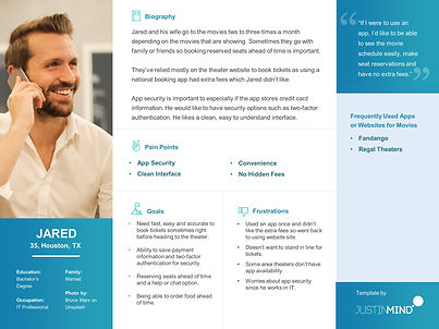
Personas and Empathy Mapping
From my interviews, I created two aggregated personas combining similar behaviors.
*Lesson Learned: Be sure to look for common denominators in the user interviews to combine into aggregated user personas.
Define Phase
Lo and behold, I was surprised from the user interviews that many users don’t utilize a mobile app to buy movies tickets or have used an app only a very few times. Security, hidden fees and an uncluttered interface were top barriers to utilizing an app.
Interview Insights
-
Three out of the seven participants had purchased tickets through an app.
-
Five out of seven users mentioned finding seat availability as a key feature.
-
Two out of seven didn’t feel comfortable with the level of app security in other apps.
Pain Points
-
Users didn’t like the extra fees associated with buying tickets through a competitor’s app. (Financial)
-
Users want an easy-to-understand interface and straightforward ticket purchase process. (Product)
-
Users want the ability to easily view movie schedules. Sometimes too much clutter. (Process)
“It's typically easier to use theater's website.” - Movie Goer
Opportunity Statement
I wanted to create an opportunity statement since this new app would need to find way to attract new users to the platform.
How might we increase user confidence to utilize a mobile app instead of a website which will provide users a straightforward and secure process to find movies, purchase tickets, and reserve seats.

App Features
By grouping potential app features users valued by category, I could start to see the patterns for potential features.
*Constraint: An app can't be everything to everyone and there are business goals so would there be trade-offs on the features that could be in the app?
User Journey Mapping
In order to reduce the obstacles for users to find and purchase of movie tickets (and be happy throughout the process), I mapped out the user journey for each persona.
*Lesson Learned: Oh no, my bias was creeping in the journey map as I have used movie ticketing apps in the past. I had to try and keep what the users said foremost.


Sitemap and Information Architecture
While I'm familiar with site maps in website design, I had never built an app sitemap and information architecture.
*Lesson Learned: I made a design decision for a simple sitemap but looking back, it still may have too many screens.
Ideate Phase
Sketching
I created quick sketch ideas using the crazy 8s method was fun and brought back memories from my college art classes. These first sketches were about what came immediately to mind rather than functionality.
*Lesson Learned: In later sketches, I pulled elements that corresponded to the app feature list from above and began to think about functionality.


Wireframes
From my crazy 8 sketches, I began to explore how to build low-fidelity wireframes and prototypes in Figma. I also built them in AdobeXD to compare each program. I studied mobile patterns and different UI kits to understand the makeup of wireframes. I incorporated icons and systems from Material Design. The icons I used are by Icons by Icons8.
*Lesson Learned: An early mistake I made in the first draft of the wireframe design was to put the navigation bar at the top. As I learned more about mobile patterns and how users utilize their phones, I moved the menu to the bottom.

First Draft Wireframe
Doh! Navigation menu at the top.

Second Draft Wireframe
Could I make the top navigation work?

Second Draft Wireframe
Better! Navigation bar at bottom makes more sense.
Brand Identity and Logo
Now was the fun part Now was the fun part to bring my inner marketer back out to develop a brand identity. I wanted a simple and clean logo and really like playing with text treatments.
Core Brand Archetype: The Everyman
Brand Purpose: Connecting movie goers to the movies they love to see.
Brand Voice: Friendly, informative, trustworthy
Brand Personality: A real movie enthusiast who loves the entire movie going experience.
Brand Value: Convenience, ease, facilitation
App Style Guide
I began to build a style guide with colors, fonts, and components. I'm incorporating what I'm learning about accessibility and checked my color palette through Adobe's color contrast analyzer and the Material Design tool.
*Lesson Learned: From my graphic design background, I could draw buttons and other elements in Figma, but I needed to understand states, elevations and building complex components.
Testing Phase
Usability Test
Conducting early app concept usability tests with users was an eye opener. I was only able to get five participants and their feedback provided different insights about the app. I created a sample presentation deck to be able present to stakeholders.
Lessons Learned: When I asked users to review my prototype, many weren't sure what "prototype" meant and about the functionality in the Figma view. For future testing, I need to be aware of UX terms when talking with users.
"I was confused as I usually search for theaters first.” - User

Before Usability Test
Usability Test Insights
1. Users overwhelmingly said they want the option to search by theater first.
Four out of five users mentioned about the "Find Movies" screen was confusing on how to use it.
Updated Wireframe Considerations
-
Deleted previous screen and added search buttons from that screen to find theaters.
-
Updated text above search buttons and updated button text from “Set Location” to “Go to Theaters.
Prototype Phase
High-Fidelity Designs
I can't believe it's time to take everything I've learned and build a high-fidelity prototype. Since I'm in the Google certification course, I decided to create a Google Pixel 2 phone and utilize the Material Design system. My goal was to keep accessibility principles in mind but once I finished, I would go back and examine the designs to look for improvements.
Design Considerations
Creating an inclusive and accessible mobile app was an important consideration and overall functionality and ticket purchase flow. Overall design considerations included:
-
Checked all colors through Adobe and Material Design color checkers to meet WCAG contrast standards for accessibility.
-
Provided clear and meaningful text in links and any form fields. Used text and icons to indicate the action needed in any label or form fields.
-
Users want to be be able to move back and forth between app screens.
-
Users need a view of the seat map that makes sense on mobile.

User sees Welcome Screen with myTix Logo

Added the search feature at the top from the usability tests.

Users can find the closest theaters in the area.

Used cards for each movie for information at a glance.

Synopsis, reviews and trailers are front and center.

User can search for available movies times and dates.
Responsive Website Design
Now came the interesting part, how to transition mobile designs into a responsive website. While I didn't build every page, I wanted to see how the main pages for a user to find a movie would look.
Lessons Learned: I kept the sitemap I created in mind when building the navigation menu. I wanted the home page to immediately give users a way to find movies through a search bar.


Overall Project Lessons Learned
-
Overall, feedback was positive about the app and website design, layout and navigation. But how would user satisfaction translate in a real world environment. I found that my usability testers didn't give as in-depth responses to questions as I would have liked so I felt limited in my knowledge.
-
I’m still learning about UX data strategy. What metrics are important to track and can measurable outcomes on the business goals?
-
I will continue accessibility training and incorporating inclusive design principles in design.